Digital Marketing Agency Blog
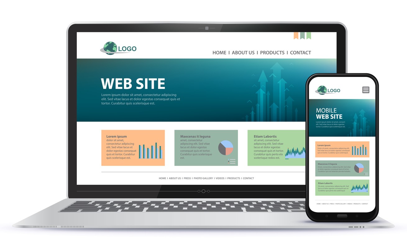
Learn more about web design, eCommerce, SEO, and more

Learn more about web design, eCommerce, SEO, and more

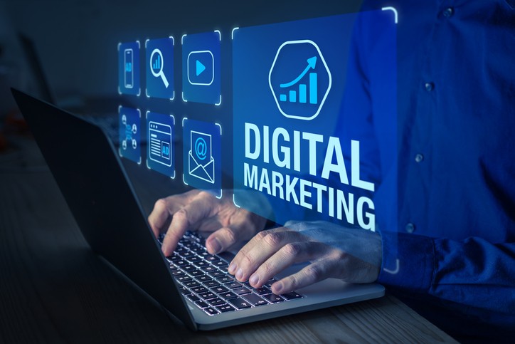
In today's fast-paced, digitally driven world, businesses are increasingly turning to digital marketing as a powerful tool to connect with their target audience, build brand awareness, and drive business growth. But what exactly is digital marketing?
So, you're thinking about selling your business? That's a big move, and we're sure you've got a lot on your plate right now. Before you dive into the nitty-gritty of valuations and negotiations, let's talk about something that's often overlooked but incredibly important: your website and marketing assets.
If you're looking to optimize your online presence, you've likely come across the importance of your Google Business Profile (formerly known as Google My Business and even earlier Google+/Google Places).

Whether you're working with a local small business digital marketing agency or managing things in-house, you should know that two key elements can make or break your online success: User Experience (UX) and Conversion Rate Optimization (CRO).

You’re a busy business owner. You've got your website up, your social media buzzing, and your products or services are top-notch. But how do you know if your digital marketing efforts are actually paying off? Enter the world of digital marketing analytics for small businesses

The use of AI in digital marketing is definitely on the rise, and it’s a trend that you’ll need to get on to keep up with your competitors. Below is a list of AI tools that we have researched and tested, and how they can fit into your digital marketing strategy.
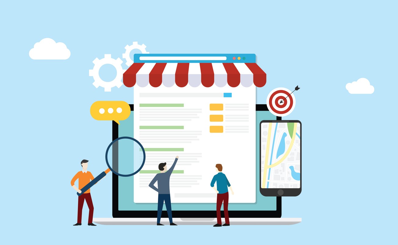
Having a well-defined and tailored digital marketing strategy is essential for the success of any small business. With the right approach, you can effectively reach your target audience, drive traffic to your website, and ultimately increase your conversions and sales.

These days small businesses rely heavily on effective marketing strategies to thrive in a competitive marketplace. To make informed decisions, it's crucial for these businesses to understand what is working and what's not when it comes to their marketing efforts.
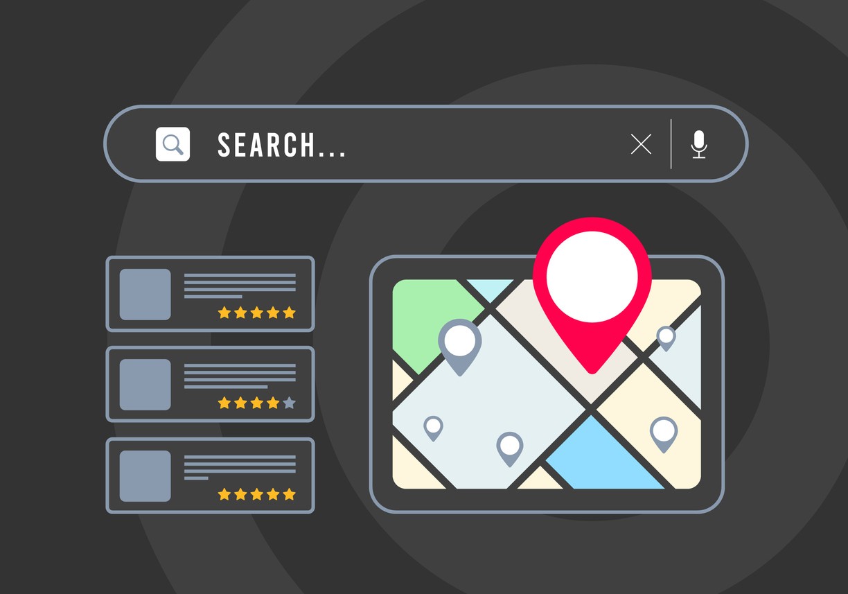
Are you looking to enhance the online presence of your small business and gain recognition in your community? Look no further! In this in-depth guide, our local search engine optimization company will break down the process of local SEO, focusing on critical components such as Google My Business listings, local keywords, and review management.