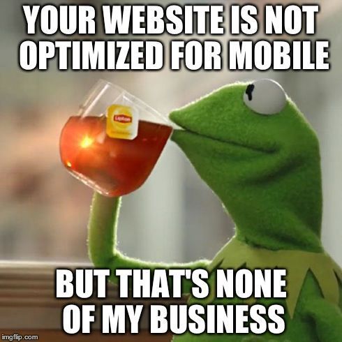
What Does Your Web Design Look Like on Mobile Screens?
Think about the last time something popped into your head and you went to search for it online. Did you rush to a laptop or desktop
computer? Probably not now that everyone has a computer in their pocket. You likely pulled out your mobile phone to search, as one does.
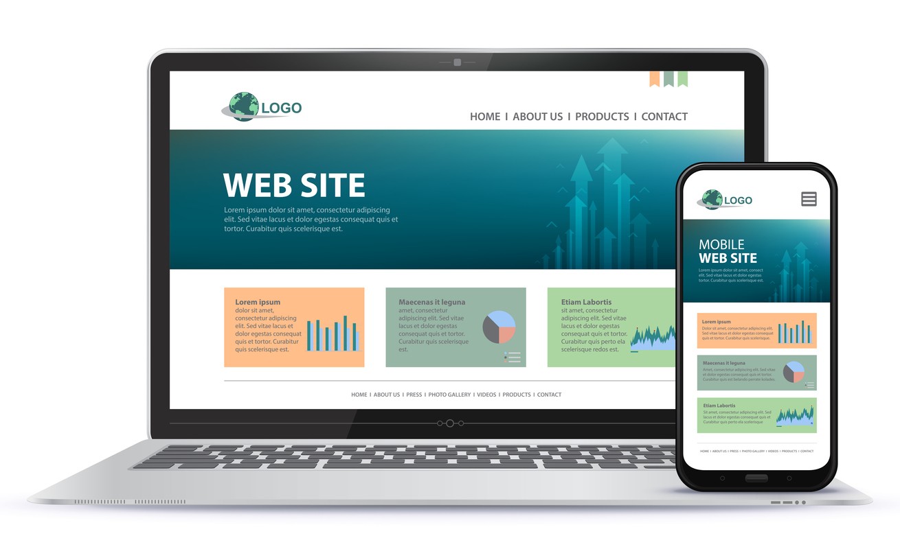
While a great desktop website is still paramount to the online success of your business, how your website design performs on other devices
such as smart phones and tablets is not far behind. Working with a digital marketing agency specializing in responsive web design, like
Smart WSI Marketing, will make sure that your website looks great and works the way it is supposed to, no matter what kind of device your
customers are using. Get in touch with us today for a free digital marketing check up!
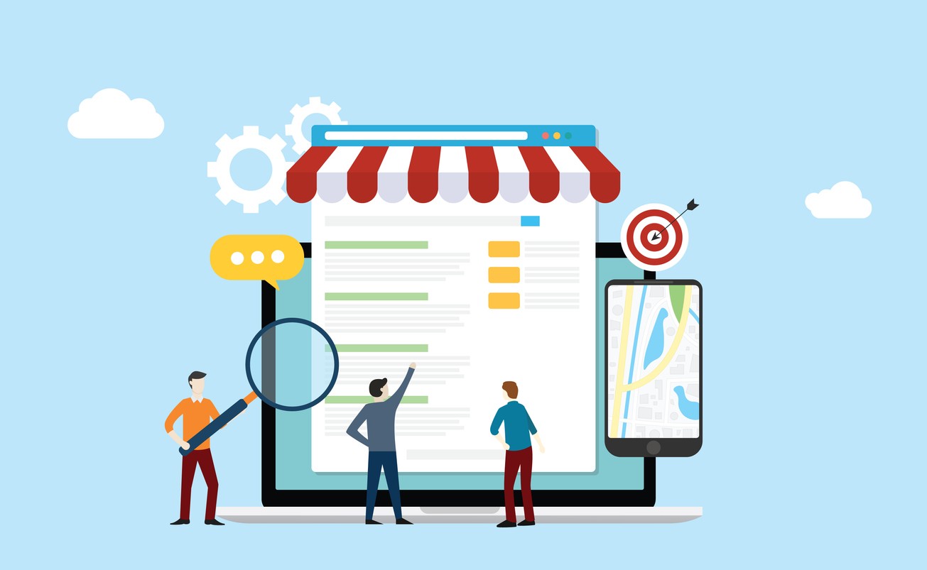
Mobile UX Matters!
Nearly everyone is searching for something on a mobile phone or tablet at some point, and a poor user experience can cost you customers. The
following mobile issues will lead to a bad user experience:
Your website loads very slowly.
It looks distorted on the user’s device.
Interactive elements on the site are too small or close together to be useful.
Users can’t find relevant information easily and must scroll excessively to find it.
You may think that if you’ve got a website that looks great on desktop, why should it matter? At least you have a website that will load on
mobile, right? It definitely matters. Unfortunately, as technology like having a full-blown computer in our pocket is more and more readily
available to us, our attention spans are shorter and shorter. If your website is riddled with problems when it comes to mobile display, your
potential customers are going to move on to your competitors.
Test Your Views
For your website to reach its full potential it needs to be able to bend, flex, and morph to fit all screen sizes and devices. One of the
wonderful things about working with an Edmonton digital marketing agency is that we carry out the testing for you, making sure that your
website behaves the way it should across all devices before it goes live. Test are carried out to make sure images are the right
proportions, fonts appear the way they should, interactive elements work, and that content shows up in the right areas of the screen, no
matter what screen it is.
Trust the Experts
Your website can be absolutely perfect on a desktop computer, but if you don’t have a responsive web design that translates across all
devices, you’re essentially shooting your business in the foot. As a business owner, you have enough things to worry about, like actually
running your business! Trust your website design to a skilled internet marketing company, like ours, and make sure you aren’t leaving your
mobile-preferred customers behind! Call us today for a consultation!
Lynne Motkoski, Digital Marketing Strategist
Specialty:
Digital Marketing Strategies Education:
MA Communications & Technology, BComm [U Alberta] Author: The
Online Marketing Handbook for Busy Entrepreneurs (coming soon)
Lynne is known for her strategic approach to marketing communications, technologies, and lead generation. She has a passion for education,
keeping up with current marketing trends and practices, and helping clients keep ahead of their competition.
When you ask a local search engine optimization company for surefire ways to improve your rankings, they will almost always tell you one of
two things: get more backlinks and get more reviews.
Read More…
In today's fast-paced, digitally driven world, businesses are increasingly turning to digital marketing as a powerful tool to connect
with their target audience, build brand awareness, and drive business growth. But what exactly is digital marketing?
Read More…
So, you're thinking about selling your business? That's a big move, and we're sure you've got a lot on your plate right now. Before you dive
into the nitty-gritty of valuations and negotiations, let's talk about something that's often overlooked but incredibly important: your
website and marketing assets.
Read More…
If you're looking to optimize your online presence, you've likely come across the importance of your Google Business Profile
(formerly known as Google My Business and even earlier Google+/Google Places).
Read More…
Whether you're working with a local small business digital marketing agency or managing things in-house, you should know that two key
elements can make or break your online success: User Experience (UX) and Conversion Rate Optimization (CRO).
Read More…
You’re a busy business owner. You've got your website up, your social media buzzing, and your products or services are top-notch. But how do
you know if your digital marketing efforts are actually paying off? Enter the world of digital marketing analytics for small businesses
Read More…
The use of AI in digital marketing is definitely on the rise, and it’s a trend that you’ll need to get on to keep up with your competitors.
Below is a list of AI tools that we have researched and tested, and how they can fit into your digital marketing strategy.
Read More…
Having a well-defined and tailored digital marketing strategy is essential for the success of any small business. With the right approach,
you can effectively reach your target audience, drive traffic to your website, and ultimately increase your conversions and sales.
Read More…
These days small businesses rely heavily on effective marketing strategies to thrive in a competitive marketplace. To make informed
decisions, it's crucial for these businesses to understand what is working and what's not when it comes to their marketing efforts.
Read More…