Remember when we thought April 21, 2015, was going to be doomsday? Ha! That was the date that Google released their major mobile
algorithm update. Despite the knee-jerk reaction, the sky really wasn’t falling. Not even close. But it did change the way we navigate
the internet at large. We do literally everything from our phones now, without even giving it a second thought, and that wouldn’t be the
case without 2015’s “mobilegeddon.” So what changed? Call Smart WSI Marketing today to make sure you werent left behind.
How Was This Update Different from Previous Ones?
One of the first differences to that particular update is that it was announced in advance. There was a lot of panic due to a comment made
by Google’s Zineb Ait Bahajji at SMX in Munich earlier that year. He stated that the update would have a much greater impact than Panda or
Penguin ever did. Should that statement have been construed as a cause for panic?
Part of the reason why the new update had a greater impact is because we are living in a time where mobile impacts everyone. The Panda and
Penguin updates focused on sites with thin content and spammy elements. These were being used by a relatively small percentage of websites.
Google’s mobile update was a totally different animal (sorry I couldn’t resist). The update actually helped and rewarded websites that were
focused on becoming more mobile friendly.
Details of the Update
The best way to summarize the details is to share this statement taken directly from Google’s announcement post:
"Starting April 21, we will be expanding our use of mobile-friendliness as a ranking signal. This change will affect mobile searches in
all languages worldwide and will have a significant impact in our search results. Consequently, users will find it easier to get relevant,
high quality search results that are optimized for their devices."
Mobile Friendly Is Everything!
These days, we do everything on our phones. Why would we go to a desktop or laptop computer to search anything when we can just pull out the
one in our pocket?
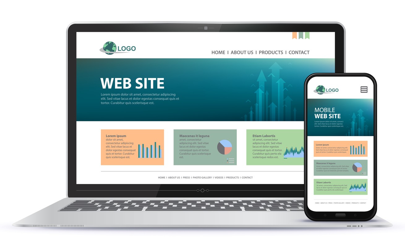
If your site is not mobile friendly, you’re missing out on a huge number of potential customers. Make sure you’re not shooting yourself
in the foot by shying away from investing in a responsive web design. A responsive web design ensures that your website looks and functions
the way it should no matter what device potential customers are using. It can bend, flex and shape-shift for desktop, tablet, Android,
Apple, it doesn’t matter. What does matter is that people aren’t leaving your site because it won’t load on the device they want to use it
on!
Furthermore, if you have included mobile ads in your digital marketing budget, and don’t have a mobile friendly website, you’re wasting your
money, and your potential customer’s time, therefore losing the chance the convert them to a customer. Clicking an ad in an app or mobile
browser that leads to a website that does not work on mobile phone is just going to frustrate that person, and they will be unlikely to seek
out your business to make a purchase or hire your services in the future.
Mobile First Indexing
Google actually took our obsession with the convenience of mobile a step further in 2020 with another mobile update that packed a pretty big
punch. Last spring, Google rolled out mobile first indexing, meaning the mobile version of your website actually gets indexed before the
desktop version. Imagine going back to say, 2014, and telling a web developer that?
Mobile is Now
Mobile-friendly is honestly a phrase that we barely use in the industry anymore. Why? Because everything is done on mobile, so of course
things are designed to be mobile friendly. It’s no longer an after thought, or cutting-edge technology, it’s just the way things are done.
To make sure that your business is keeping up, call Smart WSI Marketing today to
discuss your overall digital marketing strategy.
Lynne Motkoski, Marketing Strategist
Specialty: Online Marketing Strategies Education:
MA Communications & Technology, BComm [U Alberta] Author: The
Online Marketing Handbook for Busy Entrepreneurs (coming soon)
Lynne is known for her strategic approach to marketing communications, technologies, and lead generation. She has a passion for education,
keeping up with current marketing trends and practices, and helping clients keep ahead of their competition.
Creating a successful website is kind of like running a circus where SEO and UX are your star performers. SEO attracts the audience, making
sure people know about the show and come in droves. UX, on the other hand, is all about keeping the audience entertained, ensuring they
enjoy every moment and want to come back for more.
Read More…
Whether you're a seasoned marketer or just dipping your toes into the marketing pool, it's crucial to spread your efforts across multiple
platforms.
Read More…
For eCommerce websites, Search Engine Optimization (SEO) isn't just a strategy; it's a vital lifeline. eCommerce SEO is the art and science
of making your online store more visible in the search engine results pages (SERPs).
Read More…
Just because a visitor is not ready to make a purchase as soon as they find your business online, that doesn't necessarily mean that you’ve
lost that customer forever! Through the power of remarketing, you can coax those customers back to you and convert them into happy first-time customers.
Read More…
We’re all fairly familiar with automated review request phone calls from large companies at this point. And while they feel a little
impersonal, they serve their purpose. But I’m going to tell you the story of a review call gone wrong, and how even the big box companies
can flub their review process through poorly designed automations.
Read More…
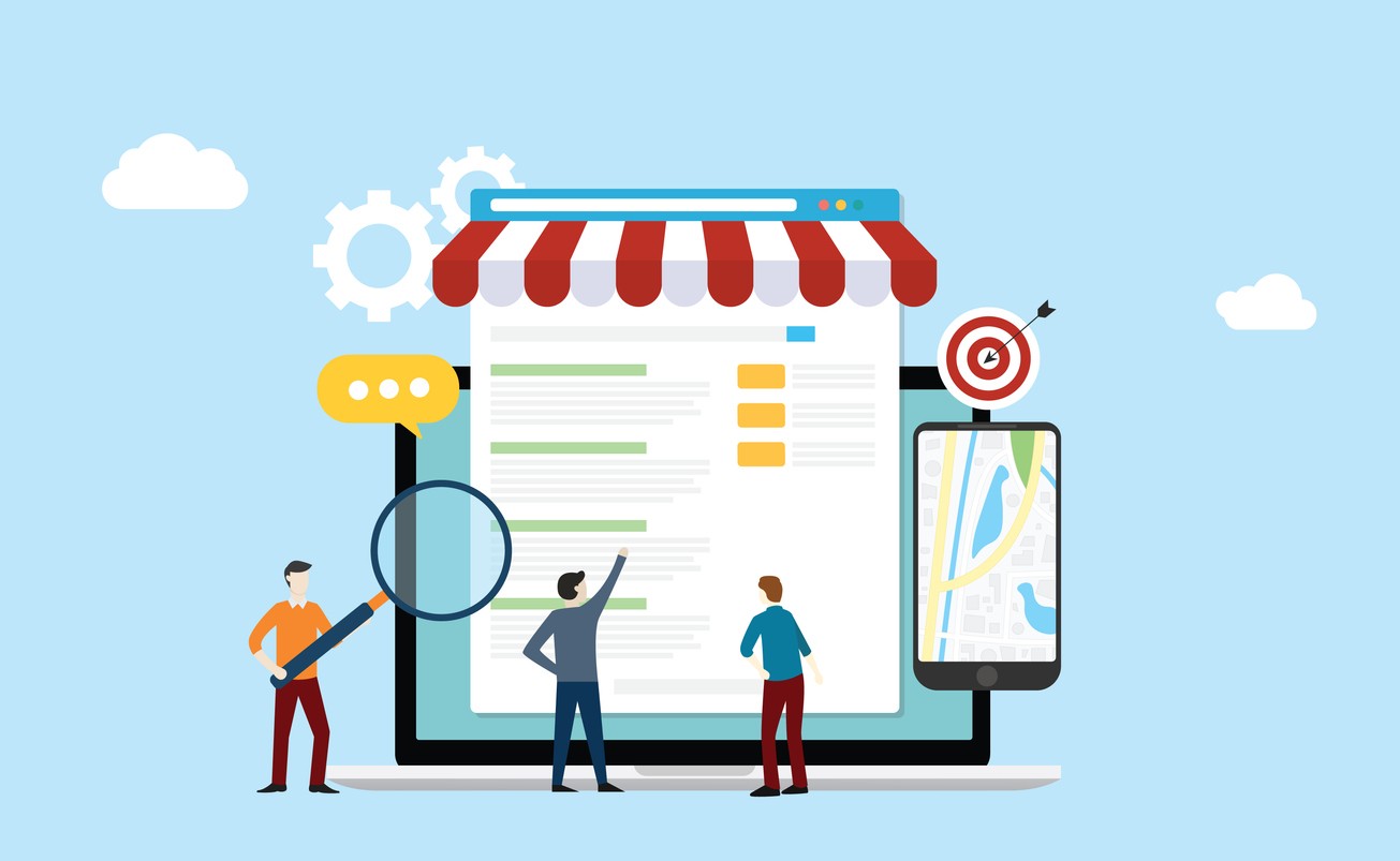
When you ask a local search engine optimization company for surefire ways to improve your rankings, they will almost always tell you one of
two things: get more backlinks and get more reviews.
Read More…
In today's fast-paced, digitally driven world, businesses are increasingly turning to digital marketing as a powerful tool to connect
with their target audience, build brand awareness, and drive business growth. But what exactly is digital marketing?
Read More…
So, you're thinking about selling your business? That's a big move, and we're sure you've got a lot on your plate right now. Before you dive
into the nitty-gritty of valuations and negotiations, let's talk about something that's often overlooked but incredibly important: your
website and marketing assets.
Read More…
If you're looking to optimize your online presence, you've likely come across the importance of your Google Business Profile
(formerly known as Google My Business and even earlier Google+/Google Places).
Read More…