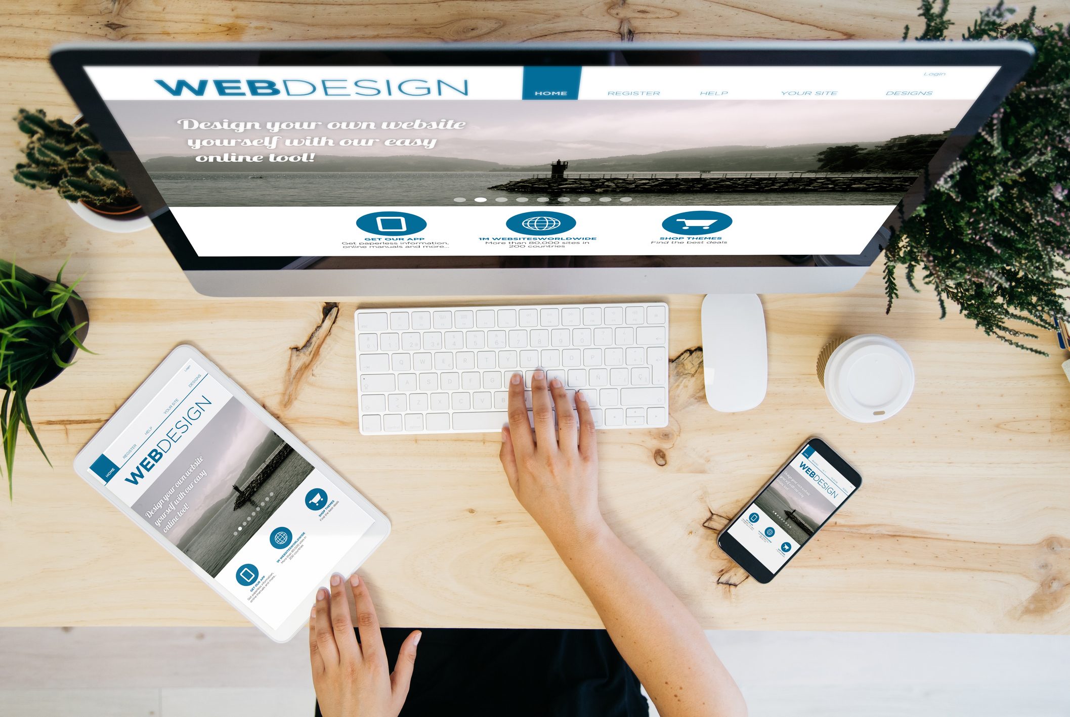
Consumers Have Changed. Is Your Website Perfectly Viewable from Every Device?
Originally posted on February 18, 2015; Updated on November 26, 2021
Have you recently gone through the frustration of trying to teach your grandma how to dial on a touch screen phone? Everyone and their cat
has a smartphone now. Not only does everyone have a smartphone, but the vast majority of us are using them for all kinds of web-based
activities from online shopping to looking at cat memes to checking their email and social media, without even thinking about it. And while
smartphone browsing is commonplace today, that doesn’t mean we can just brush off tablets, laptops, or desktop computers either.
Furthermore, how do we prepare for whatever is next? I’m sure you’ve seen someone talking into their wrist like a secret agent. Yeah.
Smartwatches. Some already have text and email capabilities, so what’s next? Thankfully, we have the technology to make sure your website is
perfectly viewable across all devices: responsive web design. Call us at Smart WSI Marketing today learn more about how a responsive web
design can augment your overall marketing strategy.
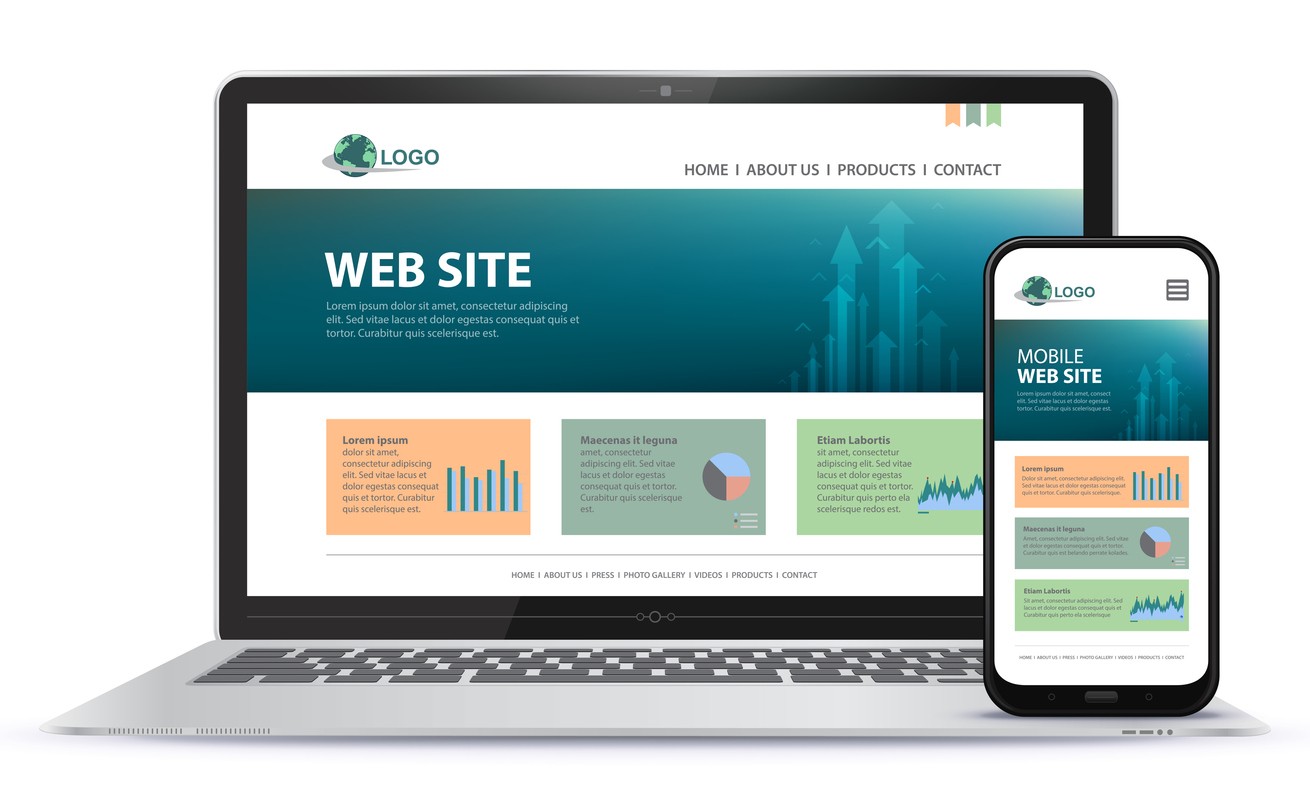
Mobile Friendly vs Responsive Design
In the olden days (like, 2010) forward-thinking marketers realized that of course they needed to have a website to get ahead in the business
world. This is a no-brainer today. The really forward-thinking marketers of the 2010s realized that you needed a “mobile friendly”
(what an archaic term!) website to keep up with the rise of smartphones, and how people were using them. This usually meant that you had
your web developer duplicate your original web design, pare it down for a smaller screen, and hope for the best. Unfortunately, a lot got
lost in translation. Now thanks to responsive web design, you no longer need to duplicate your desktop website for mobile and then just hope
it works OK. There are three major drawbacks to that approach:
While a “basic” desktop design seems cheaper upfront, it won’t be in the end. You end up spending more in the long run for multiple web
designs.
If your desktop design doesn’t translate well to other devices, you risk slow load times, missing and broken elements, and pages that are
just a nightmare to navigate. This frustrates potential customers who will just leave. Not only does that result in high bounce rates, but
they aren’t likely to come back, and you lose the opportunity to convert them from a potential customer to a paying one.
Your desktop design doesn’t translate whatsoever, and customers searching on mobile devices can’t find you at all. This means you’re missing
out on a huge number of potential customers!
Reasons to go Responsive
There are many benefits to responsive web design. Responsive web design is one web design that bends, stretches, morphs and flexes to fit
all devices, regardless of screen size. One size fits all!
User Experience: A one size fits all website means that your website looks and works the way it supposed to no matter what device people
choose to search on. If your website doesn’t work where people want to access it, they aren’t likely to make the effort to visit you
from another device. They’ll just move on to a competitor.
Low Maintenance: You only have one website to maintain! Any changes made are reflected on all devices, because its all the same website.
Easy-peasy!
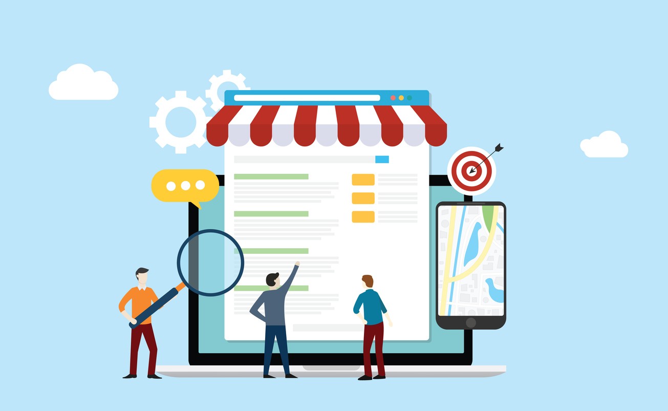
SEO Benefits: There’s one that may have not crossed your mind, but in 2020, Google rolled out a mobile-first indexing update. This means
that the mobile version of your website is ranked before your desktop version. How does a having a responsive web design play into that?
Your mobile site IS your desktop site. You don’t have to worry about a sub-par version of your website being the first one
that Google indexes, because there is no such thing.
You Can’t Out-Market a Broken Website
According to a Statista study back in August, 56% of online purchases made by Canadians in 2021 were made on smartphones. Keeping in mind
that this statistic is prior to our annual holiday shopping boom, that’s a pretty staggering number, further proving that if your website
doesn’t function properly on mobile devices, it will definitely have a negative impact on your returns. You can have an unlimited marketing
budget with dynamic campaigns with all the bells and whistles, but if it leads to poorly designed website, you’re not doing yourself any
favours. Get in touch with us at Smart WSI Marketing today to discuss your over all marketing strategy and how a responsive web design fits
into it.
Lynne Motkoski, Marketing Strategist
Specialty: Online Marketing Strategies Education:
MA Communications & Technology, BComm [U Alberta] Author: The
Online Marketing Handbook for Busy Entrepreneurs (coming soon)
Lynne is known for her strategic approach to marketing communications, technologies, and lead generation. She has a passion for education,
keeping up with current marketing trends and practices, and helping clients keep ahead of their competition.
For eCommerce websites, Search Engine Optimization (SEO) isn't just a strategy; it's a vital lifeline. eCommerce SEO is the art and science
of making your online store more visible in the search engine results pages (SERPs).
Read More…
Just because a visitor is not ready to make a purchase as soon as they find your business online, that doesn't necessarily mean that you’ve
lost that customer forever! Through the power of remarketing, you can coax those customers back to you and convert them into happy first-time customers.
Read More…
We’re all fairly familiar with automated review request phone calls from large companies at this point. And while they feel a little
impersonal, they serve their purpose. But I’m going to tell you the story of a review call gone wrong, and how even the big box companies
can flub their review process through poorly designed automations.
Read More…
When you ask a local search engine optimization company for surefire ways to improve your rankings, they will almost always tell you one of
two things: get more backlinks and get more reviews.
Read More…
In today's fast-paced, digitally driven world, businesses are increasingly turning to digital marketing as a powerful tool to connect
with their target audience, build brand awareness, and drive business growth. But what exactly is digital marketing?
Read More…
So, you're thinking about selling your business? That's a big move, and we're sure you've got a lot on your plate right now. Before you dive
into the nitty-gritty of valuations and negotiations, let's talk about something that's often overlooked but incredibly important: your
website and marketing assets.
Read More…
If you're looking to optimize your online presence, you've likely come across the importance of your Google Business Profile
(formerly known as Google My Business and even earlier Google+/Google Places).
Read More…
Whether you're working with a local small business digital marketing agency or managing things in-house, you should know that two key
elements can make or break your online success: User Experience (UX) and Conversion Rate Optimization (CRO).
Read More…
You’re a busy business owner. You've got your website up, your social media buzzing, and your products or services are top-notch. But how do
you know if your digital marketing efforts are actually paying off? Enter the world of digital marketing analytics for small businesses
Read More…